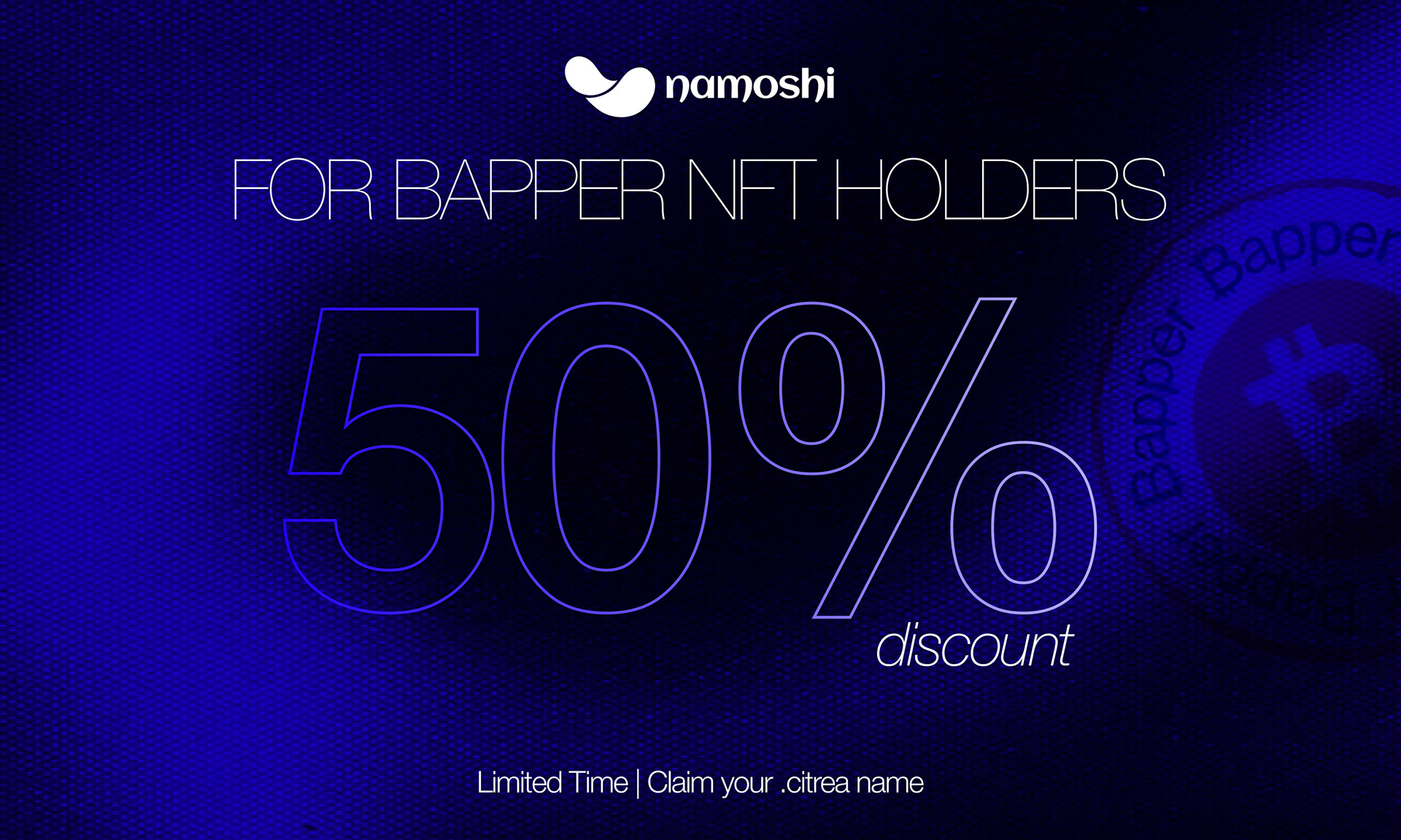
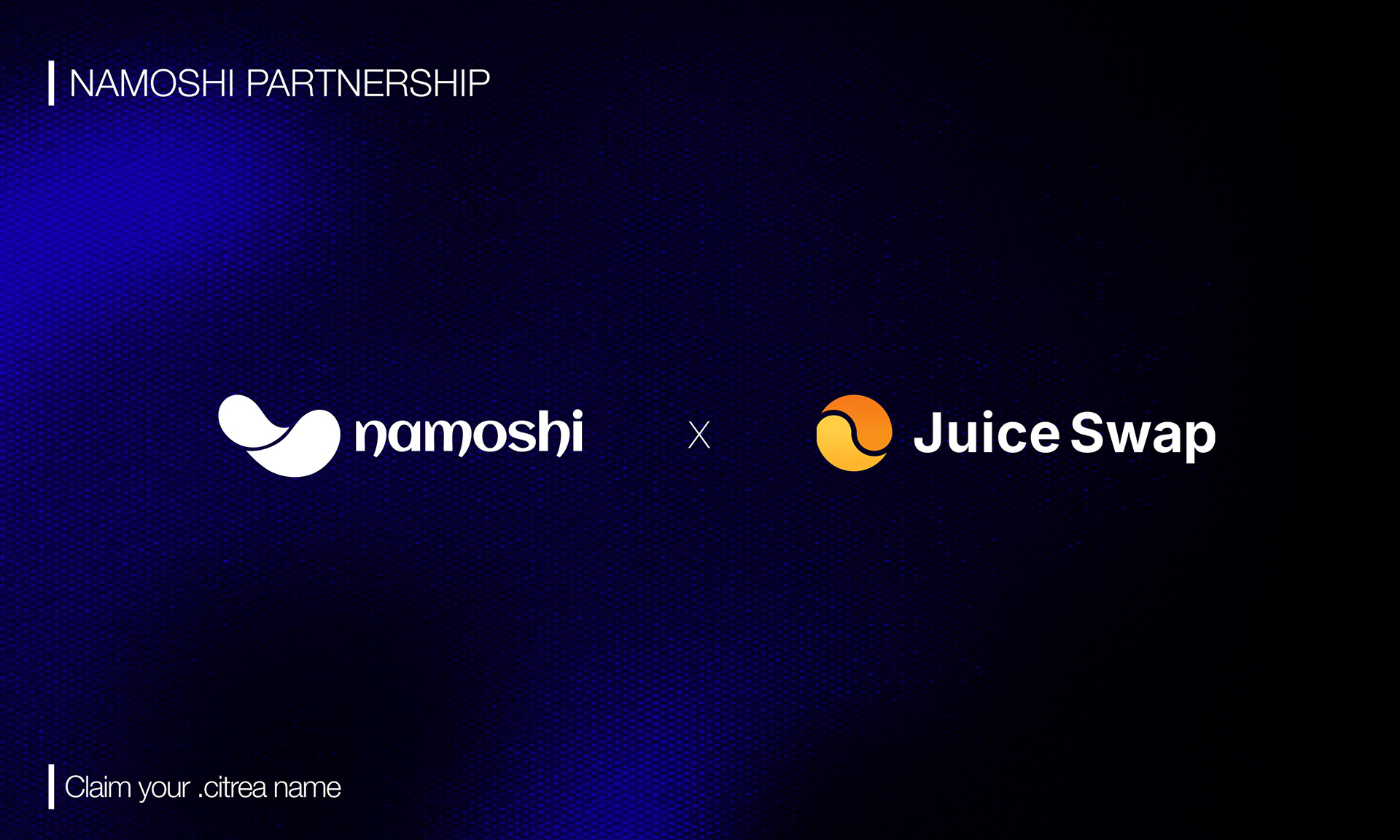
Namoshi


For the “Namoshi” brand, I developed a visual identity centered around elegance, balance, and fluid motion. During the design process, I explored organic forms and soft curves to create a logo system that feels both modern and memorable. The symbol was designed to communicate a sense of harmony and continuous movement while maintaining a minimal and recognizable structure.

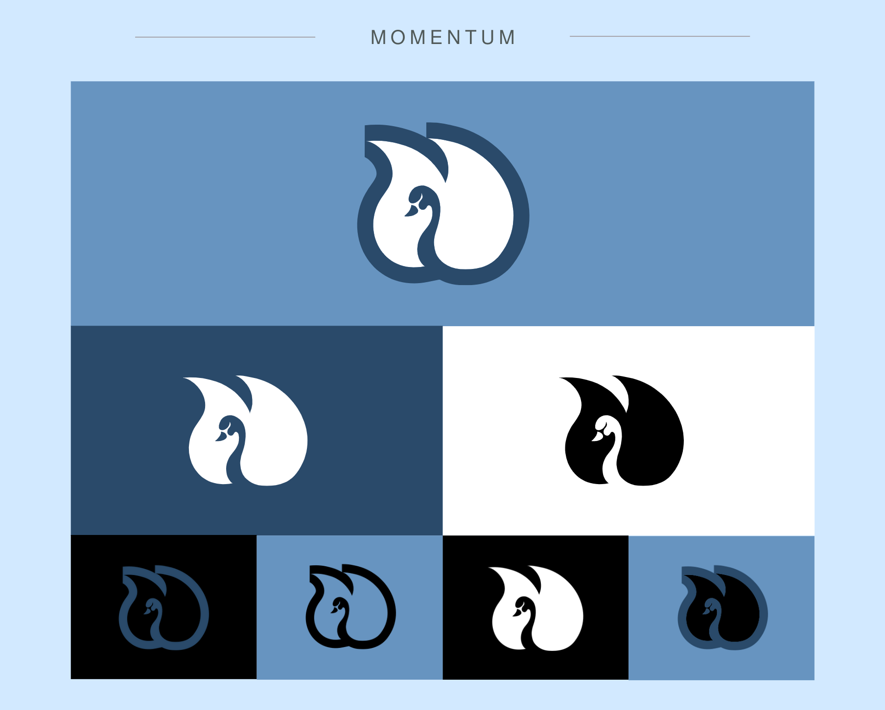
Momentum
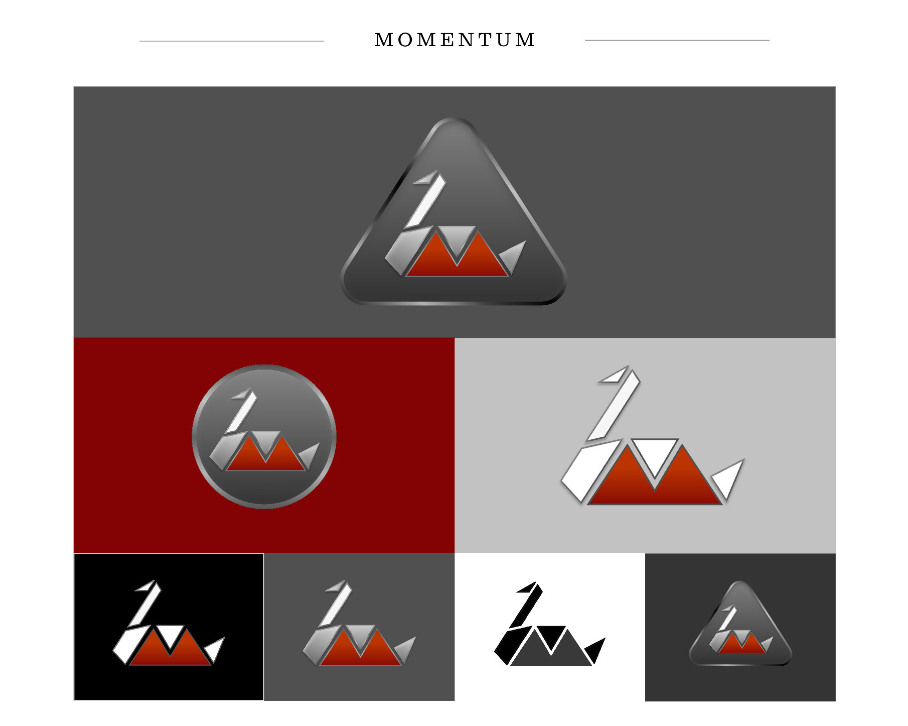
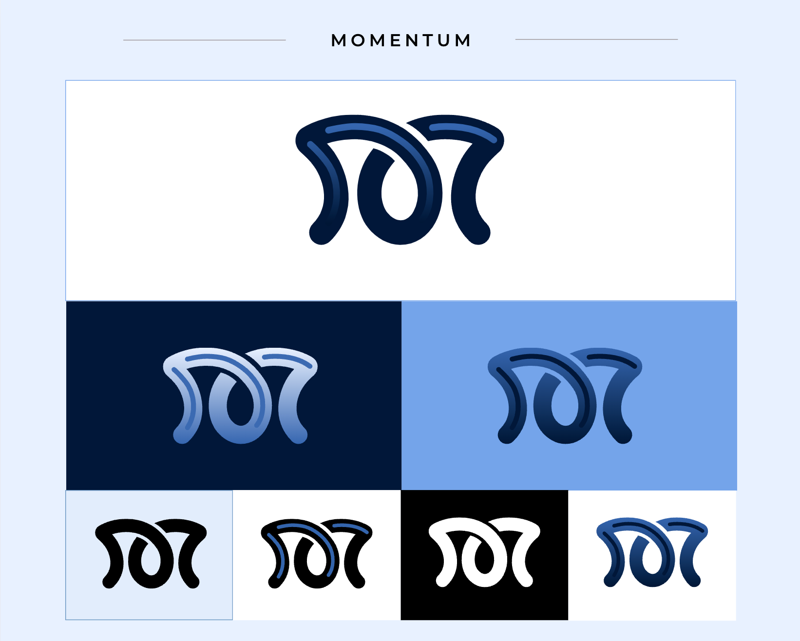
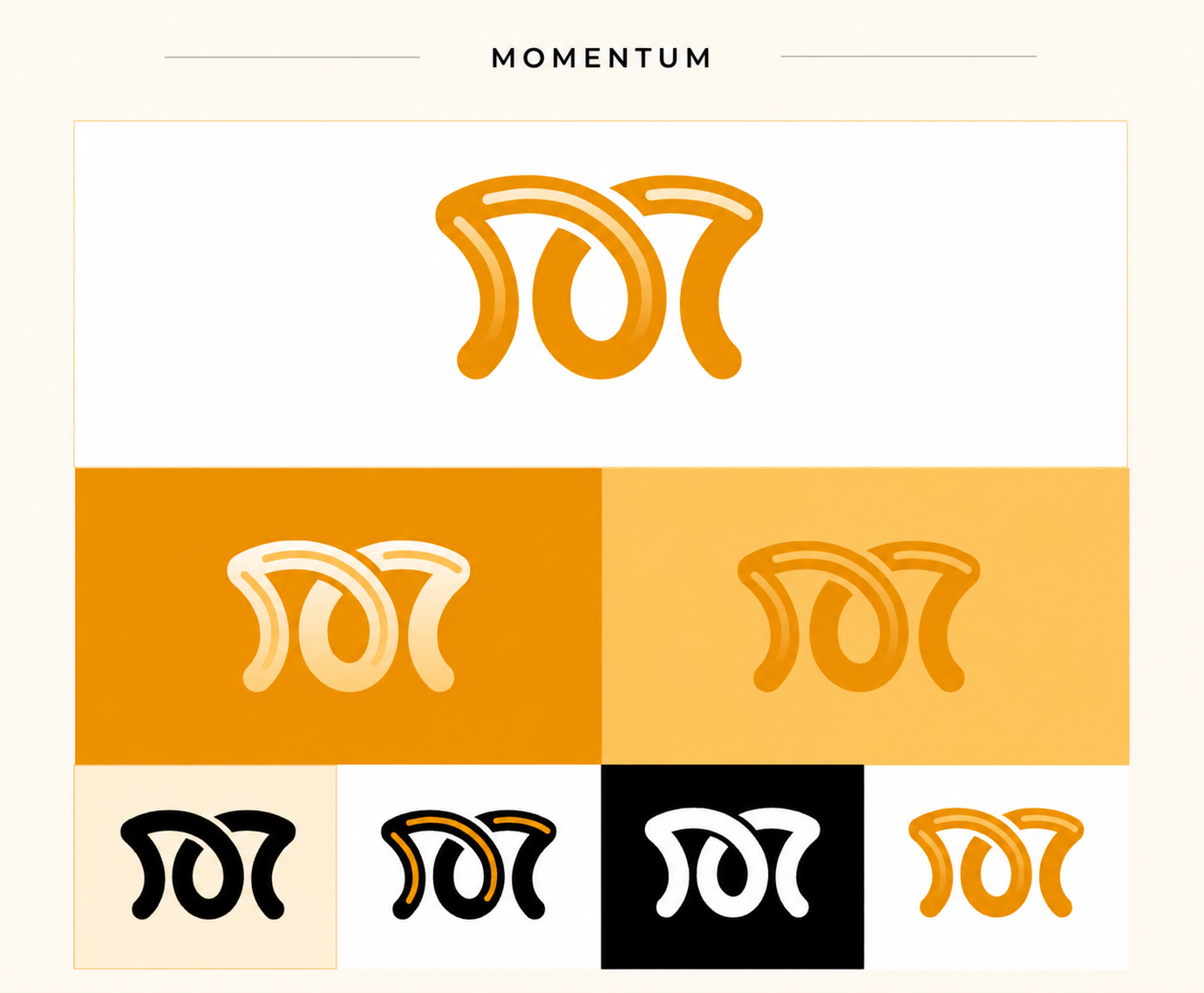
For the "Momentum" startup, I developed two distinct logo concepts. During the design process, I drew inspiration from the swan as a physical symbol to aesthetically and meaningfully represent the concept of momentum. The swan's graceful movements and fluid form provided a perfect metaphor to visually express the nature of momentum.
Concept 1: Fluid Approach
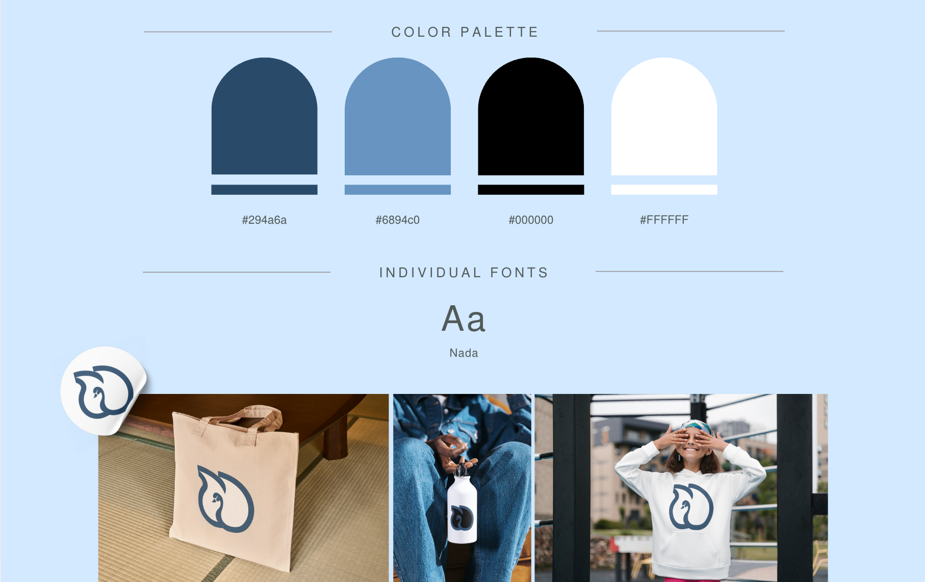
This design highlights the natural beauty and elegance of the swan, symbolizing the more organic and continuous aspects of momentum. The swan form is stylized with soft curves and minimalist details. A softer palette of blue tones and white was selected to bring a sense of balance and tranquility to the design.
Concept 2: Dynamic Approach
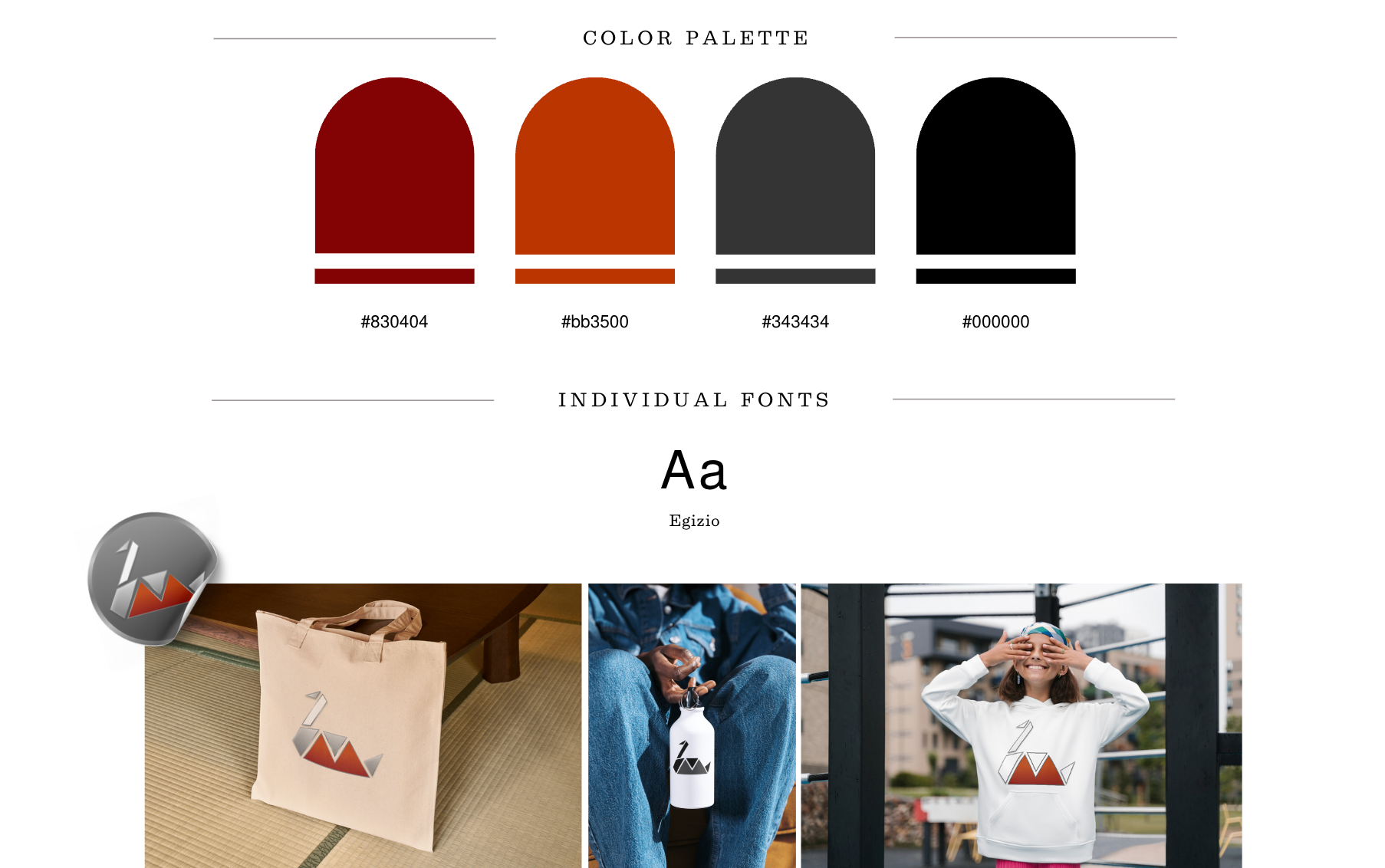
The second design emphasizes the mechanical nature of momentum, focusing on geometric shapes. Sharp edges and triangular forms convey direction and energy, while the overall design establishes a strong and modern aesthetic. A color palette of dark gray, red, and black was chosen to add a sense of power and seriousness to the design.
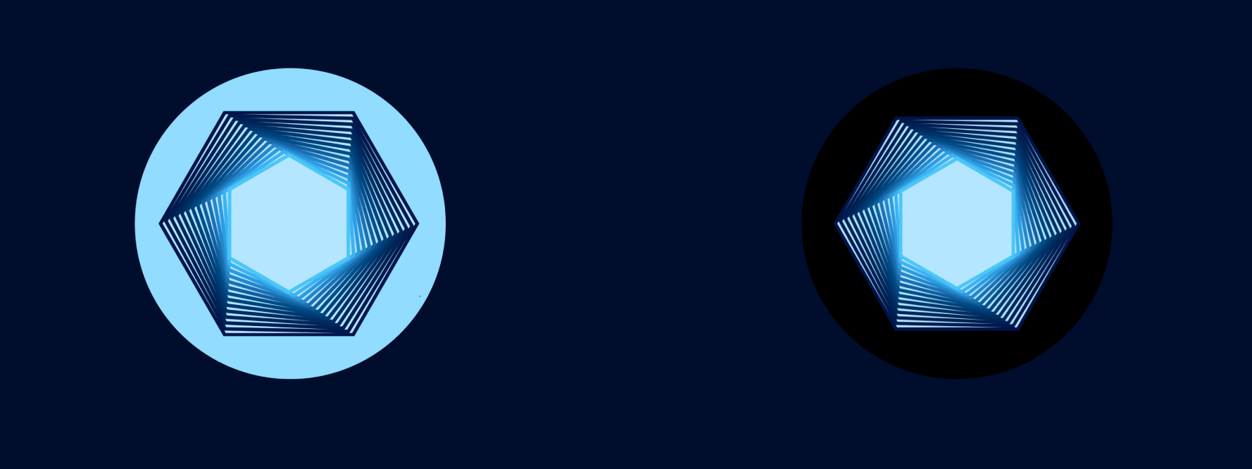
Concept 3 : Interwoven Flow (Final)
This design emphasizes the seamless nature of momentum through its intertwining forms and smooth curves. Inspired by the continuous flow of energy, the logo captures a sense of perpetual motion and progress. The interlocking shapes also symbolize connection and collaboration, essential elements of the brand's vision.
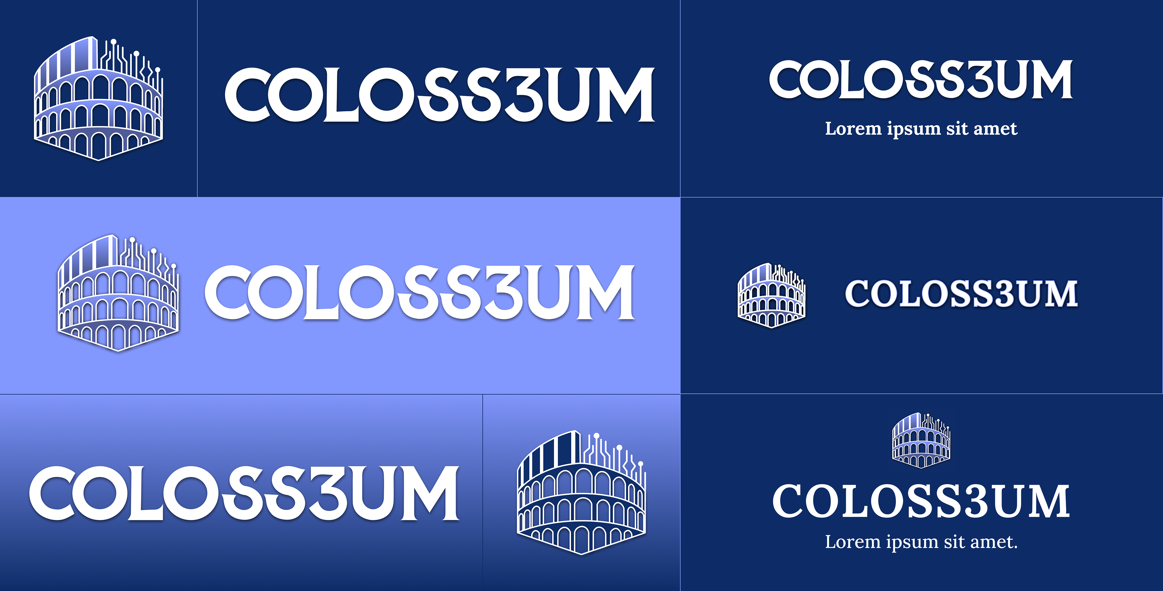
COLOSS3UM
Developed branding concepts for Coloss3um, a crypto event held in Rome. The project included multiple design approaches tailored to reflect the event’s innovative and dynamic nature.
Concept 1
This design focuses on integrating cultural and innovative elements, reflecting the spirit of Rome and the modern blockchain space. It includes versatile applications for event logos, banners, and digital assets across various platforms.

Concept 2:
The second concept adopts a sleek and professional style, emphasizing simplicity and clarity while maintaining a strong connection to the event’s identity. It’s tailored for digital and print use, ensuring flexibility and a cohesive look.
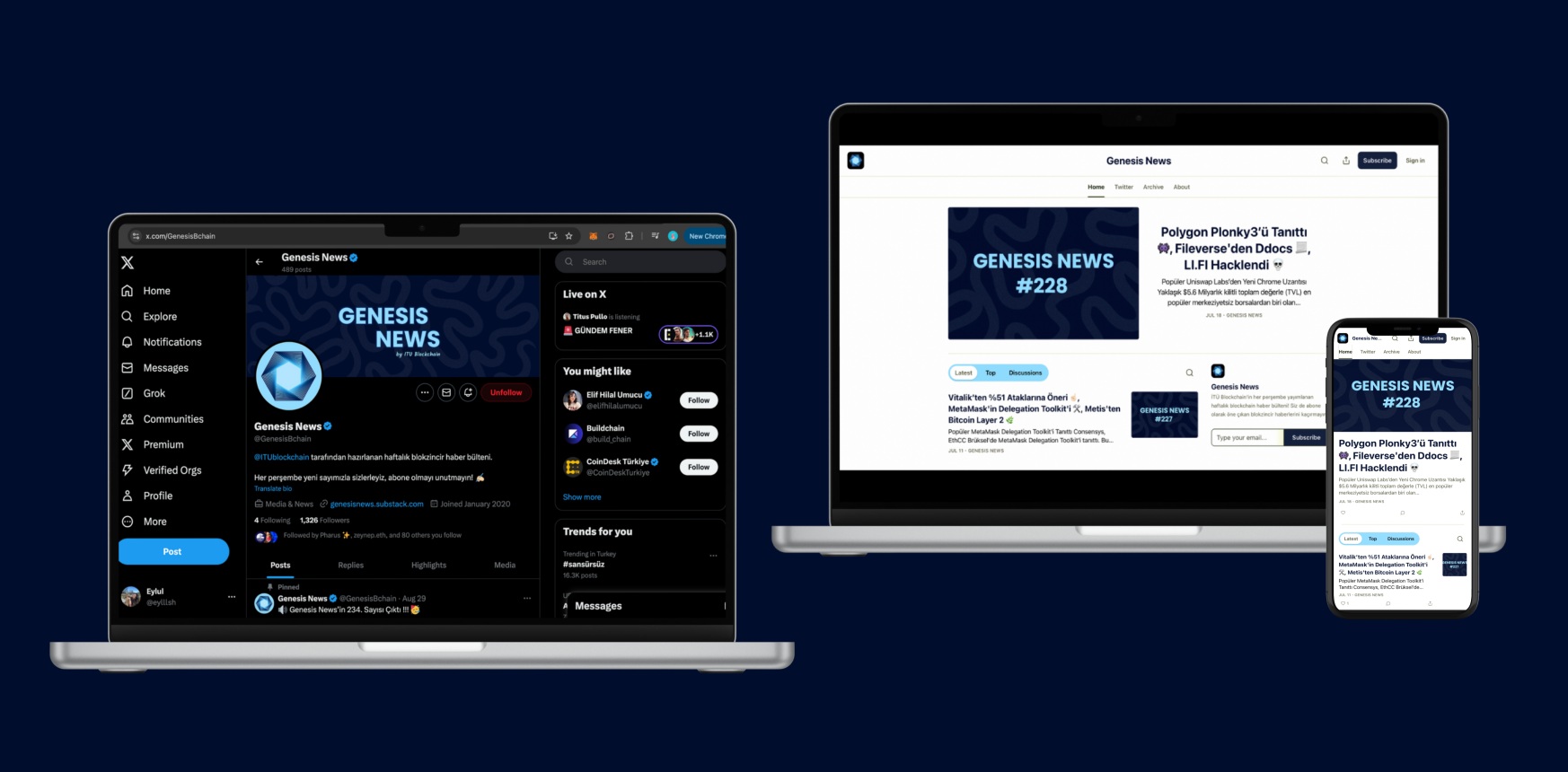
Genesis News
Genesis News is the weekly blockchain news bulletin published by İTÜ Blockchain on Substack every Thursday. I undertook the task of completely redesigning its branding to create a modern, engaging, and cohesive visual identity.